Economic Inequality
The essential data about economic inequality explained in 7 infographics. Detailed tables, charts and maps covering revenue, debt, inequality, and co2 emissions of the most powerful countries and corporations, gdp per capita, percentage of wealth held by richest and poorest americans, net worth of american households and more. Learn the truth about economic inequality and how it relates to the state of the world on The Global Education Project website with un-biased facts from the most reliable sources.
The above chart compares the world's largest trans-national corporations with the wealthiest countries and nuclear powers: Revenue, Debt, Wealth Inequality, and CO2 Emissions.
The UN Human Develpment Index (HDI) was designed to measure human development not only by economic advances, but also potential improvements in human well-being. In 2010, the HDI Report introduced an inequality-adjusted Human Development Index (IHDI)...
Page 1 of 1
Sign up for EARTH Dispatches
Enter you email below to get jaw dropping charts and maps delivered straight to your inbox.
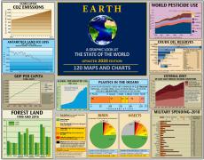
Get the EARTH presentation
A 150 page high-resolution PDF containing all updated maps, charts and data on EARTH website; use as an information-packed educational slide show, printed booklet or a set of single-page handouts.
Learn More
